Data Visualizations Gallery

Area
An area chart is a line chart with the area below the line filled with color. Often, several area charts are mapped together for comparison.

Bar
On a bar chart, numerical values are represented by horizontal bars and compared by length.
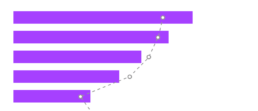
Bar/Line Combo
A bar/line combo combines a bar graph with a line graph to display a trend or compare multiple data sets. It is horizontally oriented.

Bubble
Bubble charts are used to display data points with three numerical dimensions represented by the x-axis, y-axis, and area of the bubble.

Bullet
A bullet graph is a variation of a bar graph that measures values on a qualitative range.

Column
In a column chart, numerical values are represented by the height of vertical bars.

Column/Line Combo
In a column chart, numerical values are represented by the height of vertical bars.

Donut
A donut chart is a hollow circle divided into sections that each represent a portion of the whole.

Funnel
Funnel charts represent stages in a sales, marketing, or other “funnel” process.
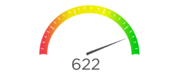
Gauge
Gauge charts use needles to show change in a single value on a dial.
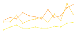
Line
A line graph displays information as a series of data points connected by straight lines.

Map
A map chart displays geolocational data.
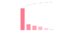
Pareto
A Pareto chart contains columns and a line, where columns are presented in descending order and the line shows the cumulative total.
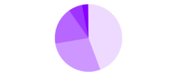
Pie
A pie chart is a circle divided into sections that each represent a portion of the whole.

Radar
A radar chart displays multivariate data on multiple axes starting from the same point.
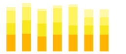
Stacked Column
A stacked column chart breaks down and compares parts of a whole. Columns represents the whole, and segments represent different parts of the whole.
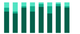
Stacked Column 100%
Similar to a stacked column chart, but each column segment represents a percentage of the whole, rather than the actual value.

Stacked Column/Line Combo
Similar to a column/line combo, a stacked column/line combo overlays a line graph on a stacked column graph.
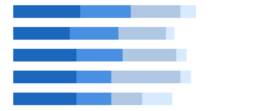
Stacked Bar
A stacked bar chart breaks down and compares parts of a whole. Bars represents the whole, and segments represent different parts of the whole.
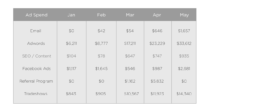
Table
A table is a set of data systematically displayed in rows and columns.
Subscribe to our newsletter
Receive our articles and insights each month via email.
