 Read time: 5 min
I’m not a gambling man, but…
I’d wager you don’t have to spend a lot of time looking at the dashboard in your car to learn how fast you’re going. That’s due in large part to how dangerous it would be if that information weren’t immediately available and understandable. It’s also due to how the information is being presented. In essence, the dashboard in your car is an example of very well-designed data. While you may not think of MPH or RPM as data, it’s precisely what those bits of information are. It’s data, presented to you in an intuitive way that allows you to drive your car safely and with as little effort as possible.
This is great when you’re cruising around town; however, the business of driving your car is more cut and dried than the business of running your business. Think about how much data you have, where it all lives and how easy it is to make sense of. Chances are the information needed to propel your business in the right direction is located in several places, making it difficult to paint a full picture of how your business is doing.
More Data Doesn’t Mean Better Information
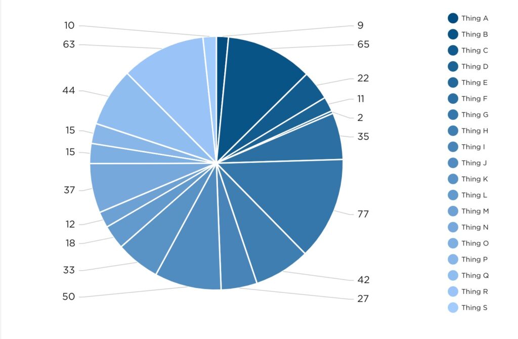
Organizing and presenting large, detached amounts of data can get messy. The use of charts and graphs to present large amounts of data can sometimes result in visually impressive graphics. However, it more often results in the presentation of invaluable information, or possibly worse, valuable information being presented in ineffective ways. For example, a pie chart with 20 slices.

Does it look special? Maybe. Could it help you make an important decision without further investigation? Probably not.
Designing Data to Make a Point
In one of my favorite episodes of the Netflix series Abstract, artist Christoph Niemann shares what abstraction means to him.
“Abstraction, to me, is getting rid of everything that is not essential to making a point.” – Christoph Miemann
If you’re not familiar with the series, this quote may seem a bit out of left field, but allow me to explain. At Pulse, we aren’t in the pursuit of creating abstract art, although we do design and develop beautiful dashboards. Essentially, what we’re aiming to do with data visualization is to answer questions. In this pursuit of answers, it’s vital to strip away all the noise that is not essential. By “noise” I’m referring to data for data’s sake – grabbing all the information that’s available and spewing it onto a presentation or dashboard with no direction or cohesion. I’m in no way implying that some data is more valuable or essential than other data, but simply that the data which is leveraged should be leveraged in a way that concisely answers a question, or provides direction crucial to driving your business forward.
In the case of our car dashboard analogy, a question needing to be answered could be: Do I have enough gas to reach my destination? To find out, you need to know how much gas you currently have, how far that amount of gas can take you, and how far away the destination is. The modern fuel gauge does a satisfactory job of indicating how much fuel is remaining in the tank and how far that remaining fuel can take you. All you need to piece it all together now is how much further away your destination is. To answer that, you need look no further than Waze or Google Maps, or Apple Maps, if that’s your preference. We don’t judge, we just hope you get to where you’re going.
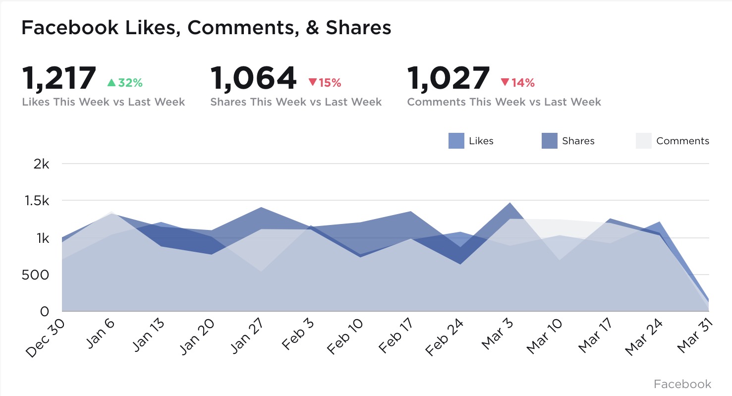
In the case of your business, a question needing to be answered could be: How are the Facebook marketing efforts performing? Taking into consideration how many layers of performance you’re looking to measure, data from various locations may need to be pulled. For the sake of brevity, let’s limit the scope to likes, comments and shares on the Facebook platform. These bits of information could be visualized as individual values or as a line graph, for example.
A better way to present not only these interaction values but their relationship to each other and time would be an area graph, like the one below.
 The visualization above not only communicates clearly the values representing each Facebook interaction we’re looking to measure, but also their relationships to each other and their performance over time. Presenting the data in this fashion allows for nimble course correction if performance starts to trend in the wrong direction, or continual forward momentum when performance is on the up-and-up. Imagine being able to instruct your Design or Marketing teams as rapidly as the data is available. No more waiting on last quarter’s performance metrics to discover what went right and what went horribly wrong.
That agile decision making power is sort of the unsung hero of data visualization. While charts and graphs may look great visually, it’s the decision making power they imbue business owners and team leaders with that lifts all ships. After all, what good is a pretty chart if it can’t lead you in a positive direction?
