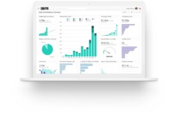
How Well-Designed Data Can Make a Huge Impact
 Read time: 5 min
I’m not a gambling man, but…
I’d wager you don’t have to spend a lot of time looking at the dashboard in your car to learn how fast you’re going. That’s due in large part to how dangerous it would be if that information weren’t immediately available and understandable. It’s also due to how the information is being presented. In essence, the dashboard in your car is an example of very well-designed data. While you may not think of MPH or RPM as data, it’s precisely what those bits of information are. It’s data, presented to you in an intuitive way that allows you to drive your car safely and with as little effort as possible.
This is great when you’re cruising around town; however, the business of driving your car is more cut and dried than the business of running your business. Think about how much data you have, where it all lives and how easy it is to make sense of. Chances are the information needed to propel your business in the right direction is located in several places, making it difficult to paint a full picture of how your business is doing.
More Data Doesn’t Mean Better Information
Organizing and presenting large, detached amounts of data can get messy. The use of charts and graphs to present large amounts of data can sometimes result in visually impressive graphics. However, it more often results in the presentation of invaluable information, or possibly worse, valuable information being presented in ineffective ways. For example, a pie chart with 20 slices.
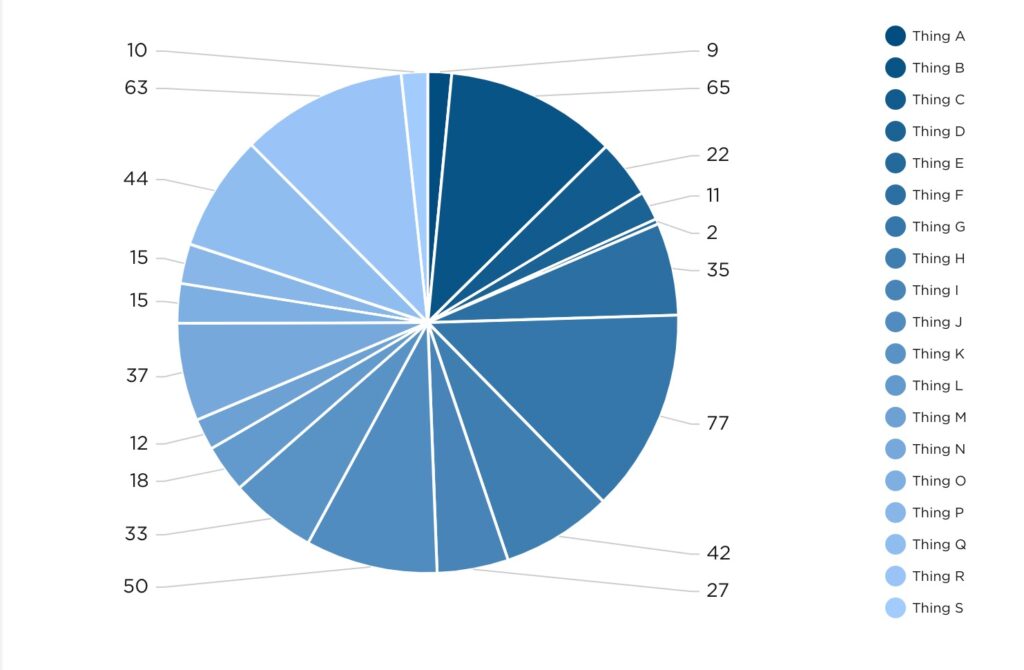
Does it look special? Maybe. Could it help you make an important decision without further investigation? Probably not.
Designing Data to Make a Point
In one of my favorite episodes of the Netflix series Abstract, artist Christoph Niemann shares what abstraction means to him.
“Abstraction, to me, is getting rid of everything that is not essential to making a point.” – Christoph Miemann
If you’re not familiar with the series, this quote may seem a bit out of left field, but allow me to explain. At Pulse, we aren’t in the pursuit of creating abstract art, although we do design and develop beautiful dashboards. Essentially, what we’re aiming to do with data visualization is to answer questions. In this pursuit of answers, it’s vital to strip away all the noise that is not essential. By “noise” I’m referring to data for data’s sake – grabbing all the information that’s available and spewing it onto a presentation or dashboard with no direction or cohesion. I’m in no way implying that some data is more valuable or essential than other data, but simply that the data which is leveraged should be leveraged in a way that concisely answers a question, or provides direction crucial to driving your business forward.
In the case of our car dashboard analogy, a question needing to be answered could be: Do I have enough gas to reach my destination? To find out, you need to know how much gas you currently have, how far that amount of gas can take you, and how far away the destination is. The modern fuel gauge does a satisfactory job of indicating how much fuel is remaining in the tank and how far that remaining fuel can take you. All you need to piece it all together now is how much further away your destination is. To answer that, you need look no further than Waze or Google Maps, or Apple Maps, if that’s your preference. We don’t judge, we just hope you get to where you’re going.
In the case of your business, a question needing to be answered could be: How are the Facebook marketing efforts performing? Taking into consideration how many layers of performance you’re looking to measure, data from various locations may need to be pulled. For the sake of brevity, let’s limit the scope to likes, comments and shares on the Facebook platform. These bits of information could be visualized as individual values or as a line graph, for example.
A better way to present not only these interaction values but their relationship to each other and time would be an area graph, like the one below.
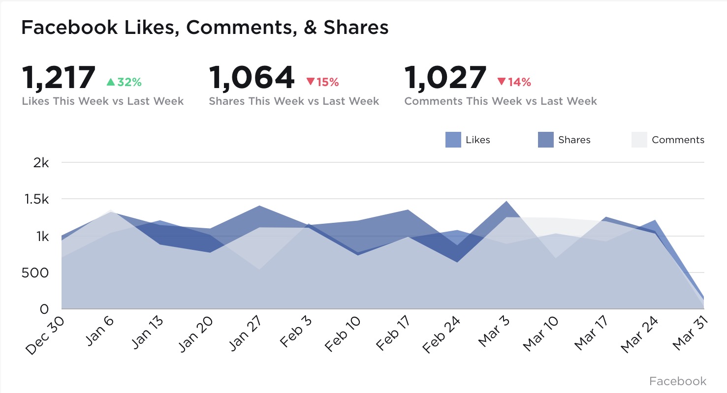 The visualization above not only communicates clearly the values representing each Facebook interaction we’re looking to measure, but also their relationships to each other and their performance over time. Presenting the data in this fashion allows for nimble course correction if performance starts to trend in the wrong direction, or continual forward momentum when performance is on the up-and-up. Imagine being able to instruct your Design or Marketing teams as rapidly as the data is available. No more waiting on last quarter’s performance metrics to discover what went right and what went horribly wrong.
That agile decision making power is sort of the unsung hero of data visualization. While charts and graphs may look great visually, it’s the decision making power they imbue business owners and team leaders with that lifts all ships. After all, what good is a pretty chart if it can’t lead you in a positive direction?

Get Plugged in to Team Health
Read time: 1.5 min
If you read our previous article announcing the launch of Eighty6’s new Business Health Service, you’re aware that it’s ideal for painting a clear picture of your business’s health. A single source of truth powering informed decisions about your day-to-day, and year-to-year business. What you might not be aware of, is that it’s robust enough to also be configured for team usage on large displays. Think about future code sprints, marketing campaigns or a customer service team, for example. Our ability to connect, pull and present data from 119 different sources and systems means user stories, squashed bugs, conversions, or the number of support tickets in a queue become brush strokes on a portrait of team performance.
In addition to elevating visibility into overall team progress, team dashboards could also aid in boosting employee engagement. Presenting in real time, the calculable impact of each team member’s contributions can create a feedback loop similar to that of fitness trackers. Except the rush of dopamine you get won’t come from crushing activity goals, but instead from crushing expectations in the workplace.
“getting everyone on the same page means getting a leg up on the day – everyday.”
While it’s fun to rhapsodize about positive outcomes, the reality of business is, it isn’t always positive. Sometimes mistakes get made, and sometimes mistakes are repeated before anyone realizes. With full transparency to constantly refreshing data, mistakes can be identified earlier – reducing their impact – and duplicate mistakes can become a thing of the past.
Whether your company is made up of ten teams of ten people, or you’re an army of one, getting everyone on the same page means getting a leg up on the day – everyday.

Does your business have a pulse?
Read time: 3.5 min
Buzzword Bingo
The term “plugged in” is one that gets thrown around quite loosely – a sharply less analog version of “finger on the pulse” that, for whatever reason, feels more substantial. It’s fitting, considering digital arenas, where access to the latest information is vital, seem to be where this term surfaces most regularly. We’ll admit, “finger on the pulse” for some inexplicable reason, just feels less than. A seemingly surface level awareness compared to being “plugged in.” Say ’em to yourself a few times. Which one makes you feel more confident: having your “finger on the pulse,” or being “plugged in”? Thought so. But what, if anything, does it really mean to be “plugged in”? Is it more substantial, or is it just a timely marketing tactic fabricated to swoon the audience into believing that being “plugged in” is an elevated form of awareness?
For Eighty6, being “plugged in” means more than just paying close attention to what our clients and the industry are doing. It means paying close attention to what we’re doing, and in this case it’s what we weren’t doing. Not just us, mind you; but the digital service industry at large.
Self-quantified
If you’re anything like us, you might be wearing an Apple watch, and you might use it – or your smartphone – to measure certain health stats throughout the day. After all, there’s nothing wrong with keeping a “finger on the pulse” of your health and wellbeing. On your wrist – or your smartphone – are colorful visualizations, which communicate at a single glance the information that’s most important to you. Now ask yourself when was the last time you checked your businesses vitals.
“Unlike the blood coursing through your veins, most businesses don’t have a single source of truth indicating their businesses health…”
Let’s say you wanted to paint a full and clear picture of your physical health. You could ask your doctor for a full blood panel, the results of which they could understand and communicate to you, and ultimately suggest any necessary corrective measures. Just like you, your business is a living, changing, growing thing that relies on numerous systems to keep everything operational. However, getting a clear picture of how your businesses health is trending is not as cut and dried, unfortunately. Unlike the blood coursing through your veins, most businesses don’t have a single source of truth indicating their businesses health, due in large part to numerous systems that don’t always integrate or share information with each other.
Businesses, including our own, have data all over the place. There’s always content being distributed through different channels, resulting in data siloed across those various channels. There are also systems and platforms used internally, responsible for scheduling, estimating, reporting, and so on. Your business might even have a system for tracking how much time is spent scraping and stitching together all of your crucial business data. Cruel irony.
The Eureka Moment!
The eureka moment came for us in early 2019, after more than eight years of designing, developing and nurturing beautiful creative and digital properties for our clients and ourselves. Not to mention, more than eight years reporting on the performance of all that creative. We would endeavour not only to close the loop in the creative life cycle, we would look inward toward operational systems and business practices.
Thus, a brand new offering, coined Business Health, was born. It’s a holistic offering that provides a clear and transparent look into the health and wellbeing of your organization. Simply put, all the various systems, both internal and external, that are vital for day-to-day operation, get “plugged in” so you and your teams can reap the benefits of at-a-glance, up to the moment information. Finally, a single source of truth for visually communicating business information that’s vital to decision making.
It was also important for us that the new offering be able to add value all on its own, or be stacked with our other service offerings to maximize results. A durable quality we’ve most certainly captured. Whether Eighty6 is your company’s A.O.R., marketing partner, development partner or no partner at all, our Business Health service makes it easier than ever to help you make informed decisions about your day-to-day and year-to-year business.