How Well-Designed Data Can Make a Huge Impact
 Read time: 5 min
I’m not a gambling man, but…
I’d wager you don’t have to spend a lot of time looking at the dashboard in your car to learn how fast you’re going. That’s due in large part to how dangerous it would be if that information weren’t immediately available and understandable. It’s also due to how the information is being presented. In essence, the dashboard in your car is an example of very well-designed data. While you may not think of MPH or RPM as data, it’s precisely what those bits of information are. It’s data, presented to you in an intuitive way that allows you to drive your car safely and with as little effort as possible.
This is great when you’re cruising around town; however, the business of driving your car is more cut and dried than the business of running your business. Think about how much data you have, where it all lives and how easy it is to make sense of. Chances are the information needed to propel your business in the right direction is located in several places, making it difficult to paint a full picture of how your business is doing.
More Data Doesn’t Mean Better Information
Organizing and presenting large, detached amounts of data can get messy. The use of charts and graphs to present large amounts of data can sometimes result in visually impressive graphics. However, it more often results in the presentation of invaluable information, or possibly worse, valuable information being presented in ineffective ways. For example, a pie chart with 20 slices.
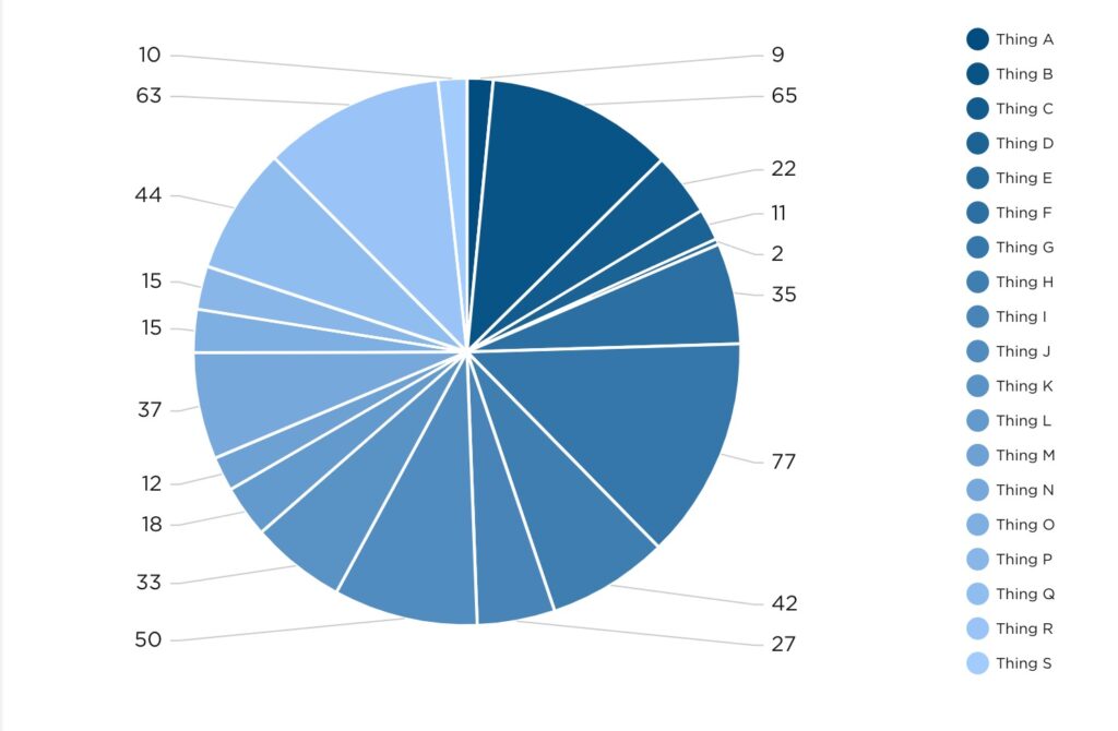
Does it look special? Maybe. Could it help you make an important decision without further investigation? Probably not.
Designing Data to Make a Point
In one of my favorite episodes of the Netflix series Abstract, artist Christoph Niemann shares what abstraction means to him.
“Abstraction, to me, is getting rid of everything that is not essential to making a point.” – Christoph Miemann
If you’re not familiar with the series, this quote may seem a bit out of left field, but allow me to explain. At Pulse, we aren’t in the pursuit of creating abstract art, although we do design and develop beautiful dashboards. Essentially, what we’re aiming to do with data visualization is to answer questions. In this pursuit of answers, it’s vital to strip away all the noise that is not essential. By “noise” I’m referring to data for data’s sake – grabbing all the information that’s available and spewing it onto a presentation or dashboard with no direction or cohesion. I’m in no way implying that some data is more valuable or essential than other data, but simply that the data which is leveraged should be leveraged in a way that concisely answers a question, or provides direction crucial to driving your business forward.
In the case of our car dashboard analogy, a question needing to be answered could be: Do I have enough gas to reach my destination? To find out, you need to know how much gas you currently have, how far that amount of gas can take you, and how far away the destination is. The modern fuel gauge does a satisfactory job of indicating how much fuel is remaining in the tank and how far that remaining fuel can take you. All you need to piece it all together now is how much further away your destination is. To answer that, you need look no further than Waze or Google Maps, or Apple Maps, if that’s your preference. We don’t judge, we just hope you get to where you’re going.
In the case of your business, a question needing to be answered could be: How are the Facebook marketing efforts performing? Taking into consideration how many layers of performance you’re looking to measure, data from various locations may need to be pulled. For the sake of brevity, let’s limit the scope to likes, comments and shares on the Facebook platform. These bits of information could be visualized as individual values or as a line graph, for example.
A better way to present not only these interaction values but their relationship to each other and time would be an area graph, like the one below.
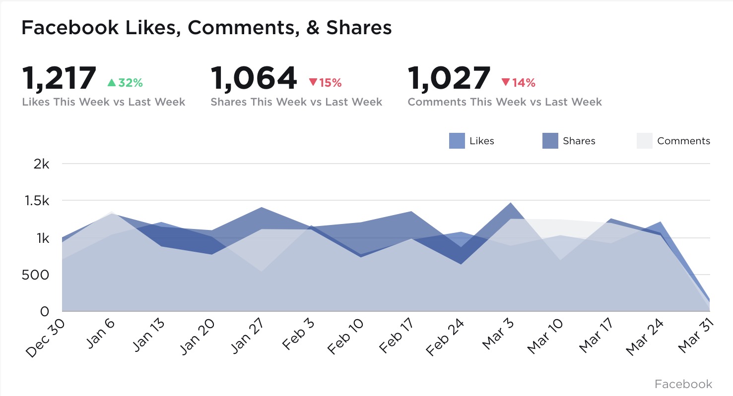 The visualization above not only communicates clearly the values representing each Facebook interaction we’re looking to measure, but also their relationships to each other and their performance over time. Presenting the data in this fashion allows for nimble course correction if performance starts to trend in the wrong direction, or continual forward momentum when performance is on the up-and-up. Imagine being able to instruct your Design or Marketing teams as rapidly as the data is available. No more waiting on last quarter’s performance metrics to discover what went right and what went horribly wrong.
That agile decision making power is sort of the unsung hero of data visualization. While charts and graphs may look great visually, it’s the decision making power they imbue business owners and team leaders with that lifts all ships. After all, what good is a pretty chart if it can’t lead you in a positive direction?

Using Your Dormant Data to Save Time & Make Decisions
Read time: 6.5 min
What to do with all this data?
The first thing to come to mind for a small business owner when hearing the word analytics is often “Google Analytics” – the tool that’s used to understand what’s going on with your website. But analytics in your business should encompass a much broader scope of information than just that. Every piece of software you use is producing data – and the problem starts there.
Small businesses typically require multiple pieces of software that each specialize in a specific topic. Your salespeople may use Salesforce.com, Pipedrive, or Copper as your CRM. Maybe your marketing agency uses Google Analytics to report on your website. Your CFO uses Quickbooks or Xero for accounting. And you’re producing work using Asana or Trello. Those tools all do a great job in their respective roles, but how can you see key data from each one, all together, in a single location?
We at Pulse by Eighty6 have the solution. We create custom dashboards so you can get in, see what you want to see, and get out. We give you your time back by giving you the information you need and can actually use to make decisions.
Unify your analytics.
If you’re even utilizing the reports currently living in each piece of software you use, you’re probably viewing them each individually – and you’re probably getting more data than you can comprehend. That overwhelming, siloed approach doesn’t work when you’re trying to understand your business as a whole entity. Instead, you want to bring the data analytics from all of your software into one single location, creating a single source of truth that you can access anytime, from anywhere, without multiple logins or waiting on a PDF. When you bring this information together, you’re able to see what you want when you want, ultimately saving you time.
Define what’s important to you.
Maybe you’ve accepted that the only analytics you’re going to get is what comes standard with each software platform you use. But the truth is that as a business leader, you will have KPIs (key performance indicators) that are important to your own unique business, and there’s nothing standard about that. Your unique KPIs are what drive the business forward. When you centralize your analytics into a single location, you’ll see everything you want to see and may even spot some new indicators that you’d never considered before. Imagine layering your financial data for the year on top of your website conversions, seamlessly, to spot trends. Or seeing potential deals from your CRM next to your marketing initiatives. It’s all possible.
Put it on a big screen or keep it private.
For those at-a-glance, company-wide metrics that your team is rallying around, a TV is a great place to view your small business analytics. These are the numbers that drive the business. Information you don’t mind your employees viewing regularly. It’s empowering to have your business intelligence on display. In most business owners’ offices I enter, when they have a TV on the wall, it’s typically filled with security cameras. What if that display also had real-time business analytics? Your decisions and thoughts will be more informed as you meet with your team throughout the day, and you don’t have to dig around your computer to get the information.
For your sensitive information, including financials or anything else you wouldn’t want people to see, you can password-protect your visualizations and view them privately on your personal devices, such as a smartphone, tablet, or laptop – anytime and anywhere. Our visualizations scale up to fit large screen TVs and down to mobile-friendly sizes. While most people are picking up their phones in the morning and viewing Facebook, you can click to get an instant health check on your business as you prepare for your day. The ability to view this info anytime saves you time. It also saves employees’ time, and it puts you in control.
We set out to save customers’ time and help you make decisions based on data, not opinions.
My background is in direct marketing, and for the past nine years, I’ve been heading up www.Eighty6.agency working with small businesses to market themselves. I found that all – yes, all – of the customers that we were providing marketing services for were never truly seeing the big picture of their company analytics. We’d prepare these great reports each week and each month, but the information would remain siloed away from other critical business data. The most feedback we’d get from our customers was being told if they were doing well financially or not doing well financially.
Our reporting on marketing was interesting to them, but if revenue was not matching it, those numbers didn’t matter. It left us in a strange position. We’re hired as your marketing experts and we know we’re supposed to deliver people to your business; but past that, we had no idea about any gaps in the business process. It was a problem. Pulse by Eighty6 was created to save customers’ time and give you a complete picture of your business using data, not opinions.